
 |
| My favorite colour combination. |
I believe that the fewer the colours in a painting, the better. Still, it's tough to limit them when you love colour as I do. Now I want to use these 5 colours in a new painting that I can spend more time developing.This past weekend I painted up a storm in the Historic Gardens in Annapolis Royal. The event, Paint the Town, is an annual fundraiser for the Annapolis Regional Community Arts Council (ARCAC). The resulting silent auction of the hundreds of paintings, sculpture and blacksmithing that is created also benefits the 75 participating artists.
 |
| My set-up at the Gardens. |
 |
Paintings from day 1: the begonias. (The iris were painted beforehand at home) |
Here is a display of all the paintings from the weekend. You can see more detail by clicking on the individual image.


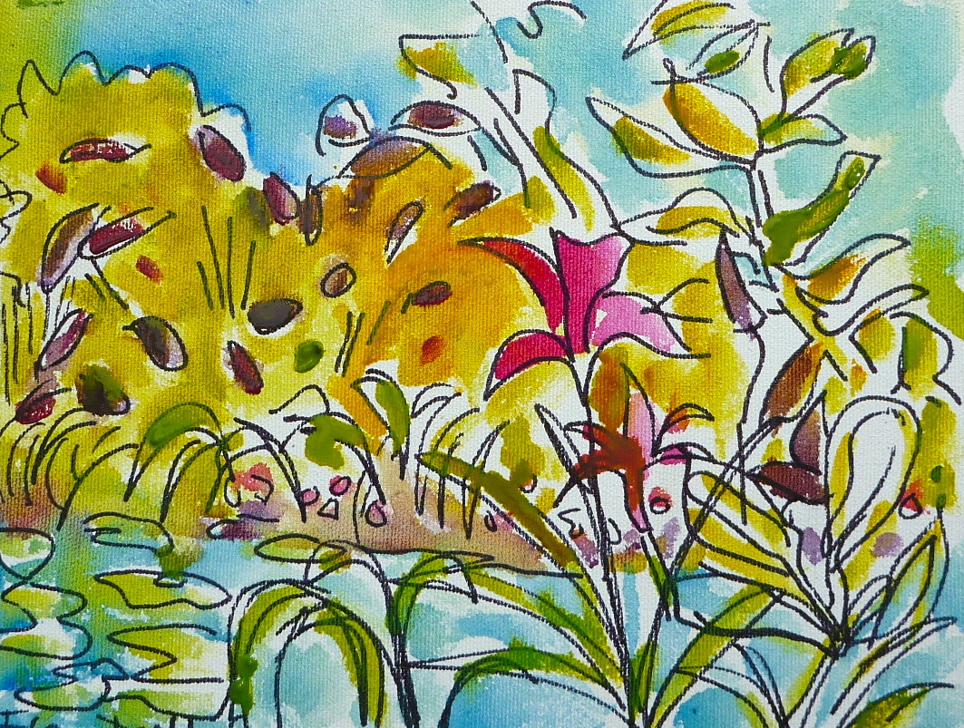


I used two different approaches to painting these small paintings. Either I mixed the paint with a lot of matt medium and scraped lines with my rubber-tipped tool, or I used a marker to draw a line-drawing on the canvas, then painted watered fluid acrylics overtop to create a soft, watercolour feel. Those paintings I sealed with matt medium.
All but one of my paintings sold. The painting with the blue blooms and the pink background came home with me along with a charcoal sketch.
I bought a beautiful monoprint from Nova Scotia printmaker Bob Hainstock. I love it and I will post it here soon.
These are fantastic, Flora! pure joy, really. I'm not surprised they sold so well. Congratulations!
ReplyDeleteA giant post of awesome paintings. Of the colors in the first painting, i am intriued by the indigo ( i think that's the color) next to the turqouise. All of your paintings are fun and inspirational.
ReplyDeleteNicki, thanks so much!
ReplyDeleteCathy, thank you! That blue is Anthraquinone Blue and it is a fluid acrylic from Golden. When applied as wet in wet with water it has a gorgeous spreading ability. You can see what i mean in the sky of this painting: http://www.flickr.com/photos/fromgreenwillowstudio/5059030224/in/set-72157623945189770
ReplyDelete